Goldtower Central is a vibrant, developing tourism, shopping, and industrial precinct in Charters Towers, Queensland. Collaborating closely with the owner, my team and I have contributed to creating an inviting destination that attracts major brands, serves as a cornerstone for the local community and a tourism desination.
Through my work with Getbranded, I’ve had the opportunity to collaborate with renowned brands such as Harvey Norman, Supercheap Auto, Pets Domain, Choice, Mitre 10, Rivers, and W. Titley & Co. My contributions have spanned promotions, event planning, social media management, and designing impactful signage.
Our marketing strategy for Goldtower focuses on three key areas: retail, tourism, and community. To encapsulate this vision, we use the slogan "Visit, Shop & Discover."
Below is a curated selection of projects I’ve worked on for Goldtower Central, showcasing the range of creative work that has brought this precinct to life.
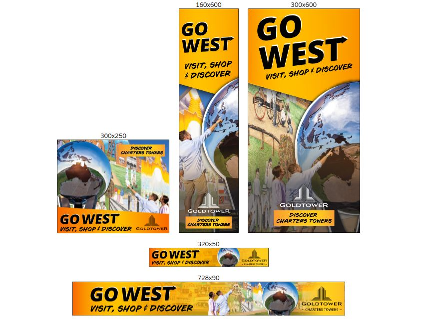
BILBOARDS
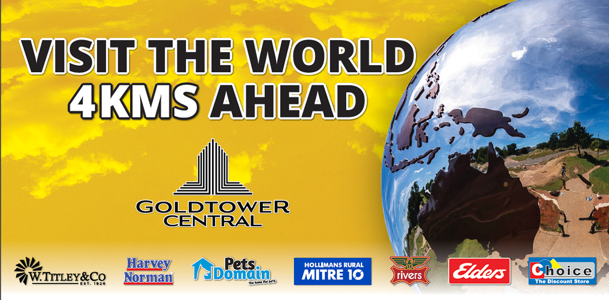
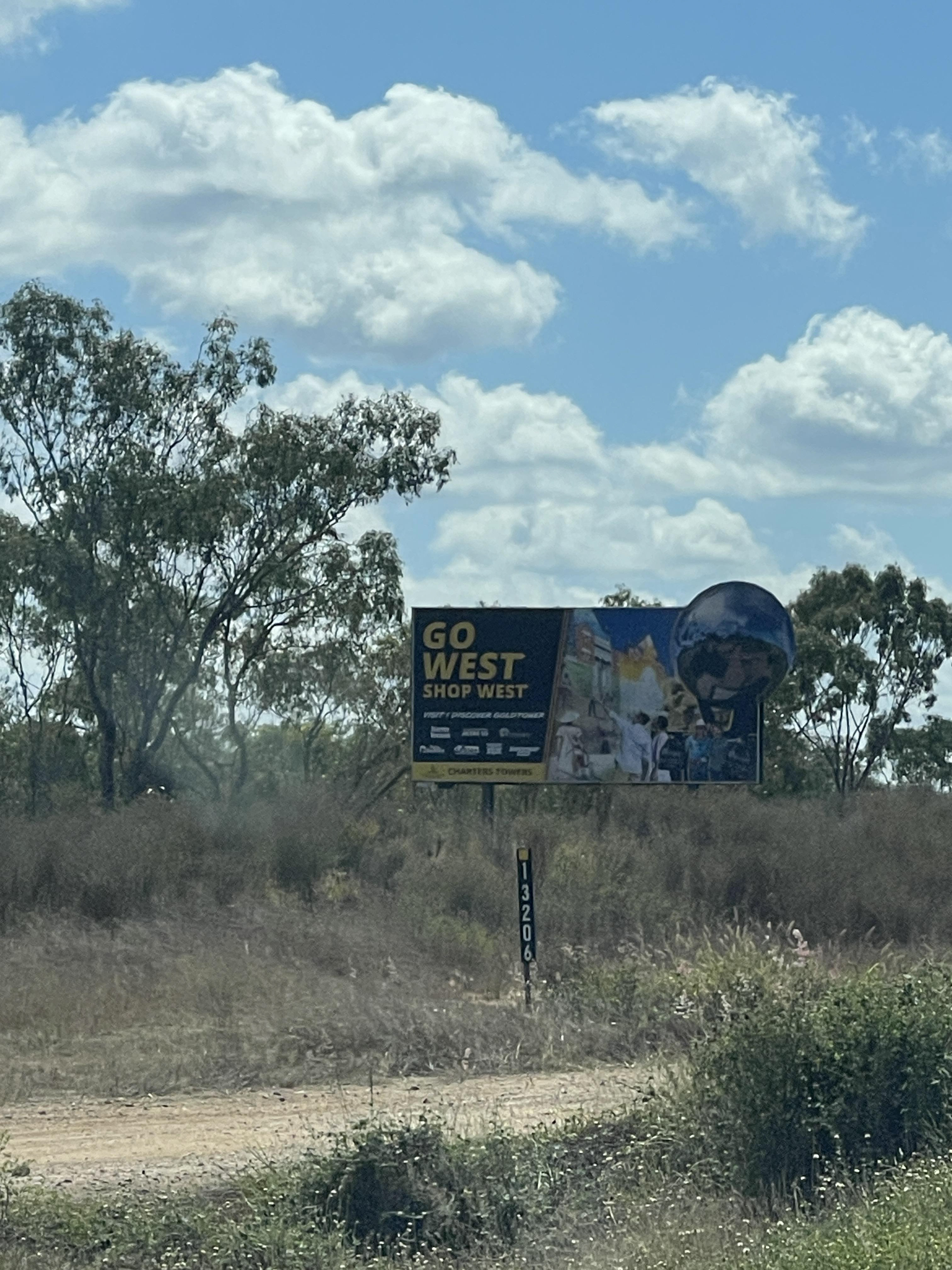
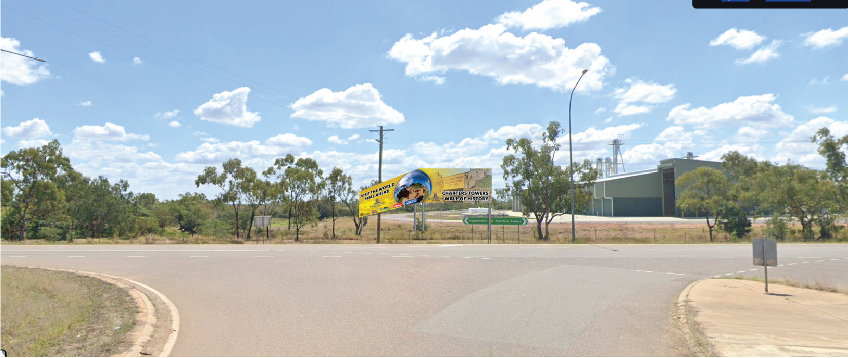
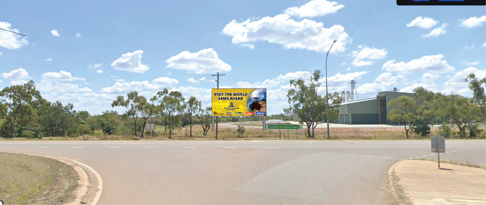
These are example of some of the billboards I have mocked up and created for Goldtower.
Image 2 is one I am quite proud of with the billboard extension.
DID YOU KNOW
This is one of the projects I am most proud of.
For this project, I developed a creative concept for ground tiles to be placed along pathways within the precinct, aiming to add a unique and engaging feature to Goldtower Central.
The process began with brainstorming and researching different plaque designs to inspire the overall aesthetic. Collaborating with a local Charters Towers historian, I helped create a collection of fascinating “Did You Know?” facts about the region, paired with carefully selected historical images to bring the concept to life.
After refining the idea, I presented it to the owner of Goldtower Central, who enthusiastically approved the project for further development. From there, I worked on restoring old photographs in Photoshop to ensure they were suitable for etching onto stainless steel. This included repairing water stains, fixing tears, enhancing faded details, and ensuring the images met the technical requirements for production.
The project features a mix of metal types, with the central plaques made of etched stainless steel for durability and detail. While the tiles have yet to be installed, I was thrilled to preview the finished pieces straight from the factory, as shown below.
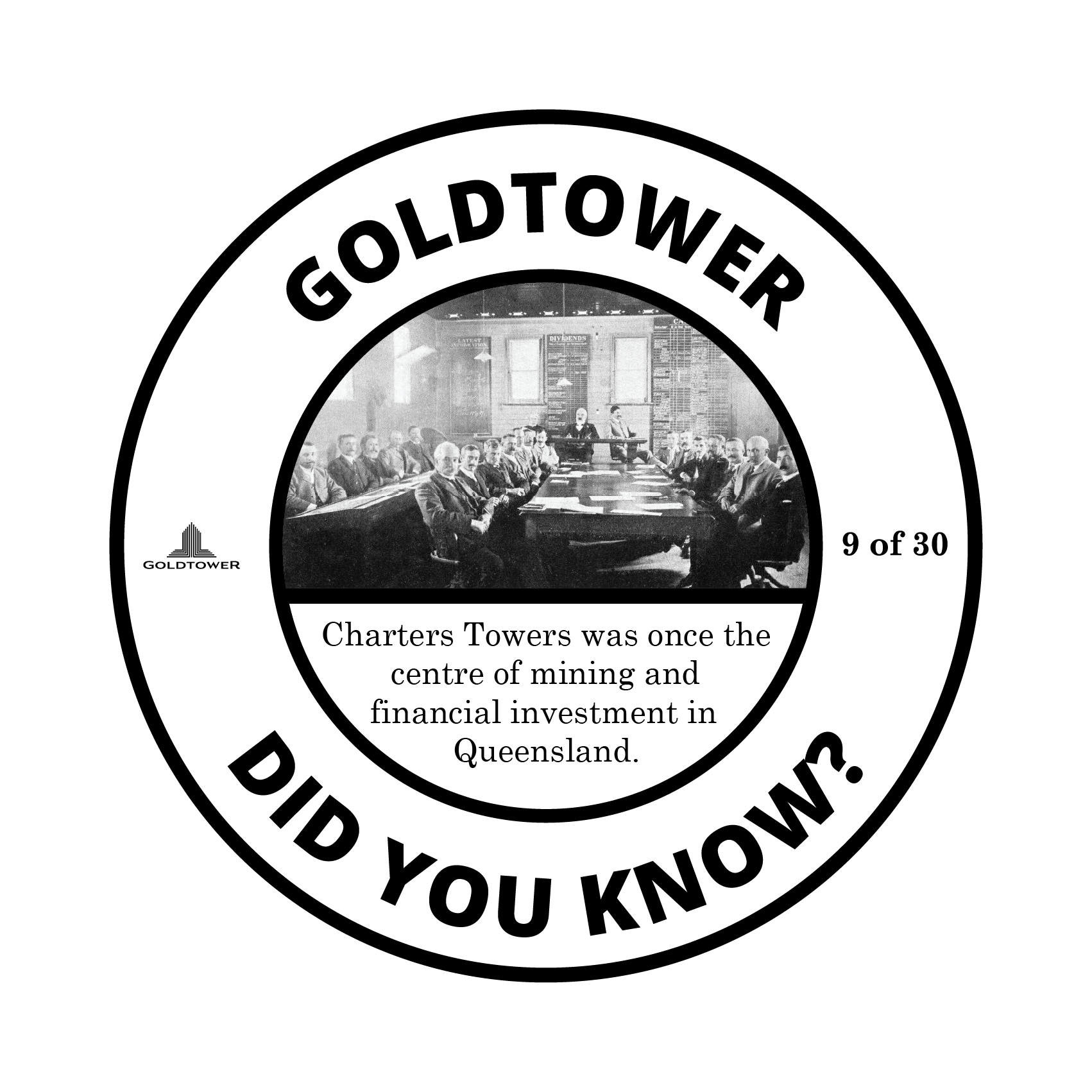
Print files
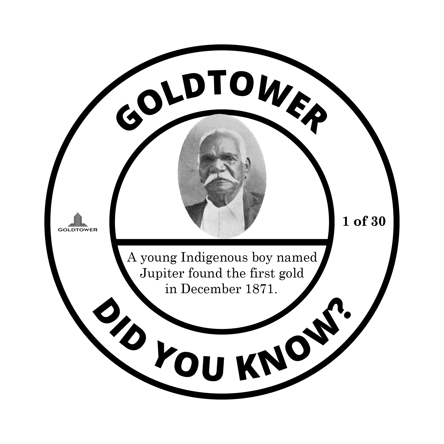
Print files
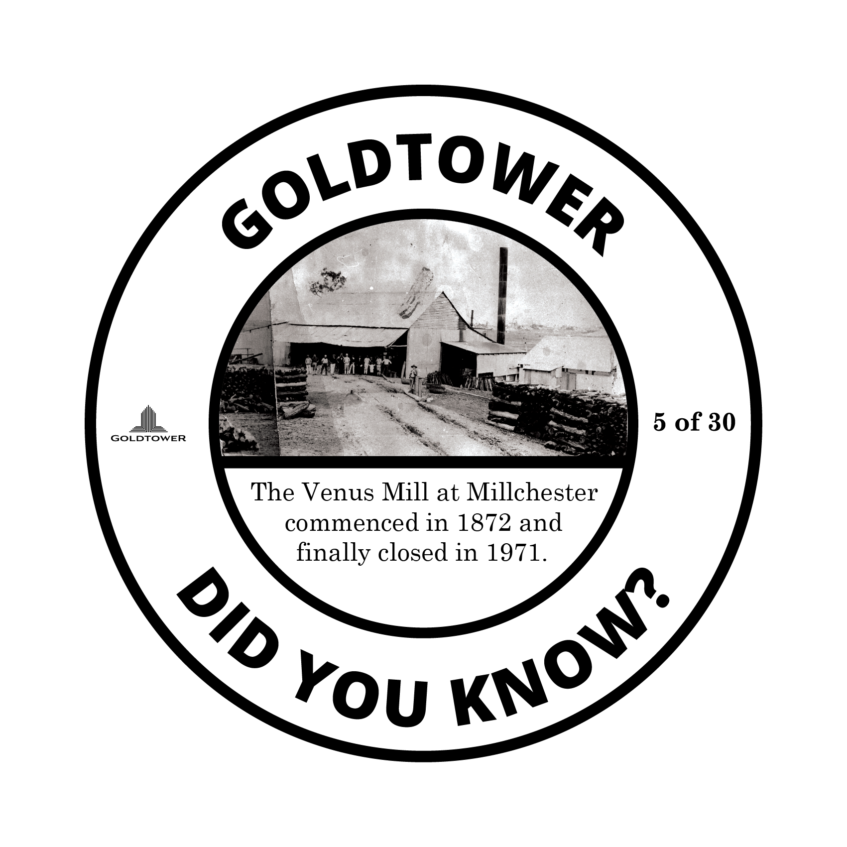
Print files
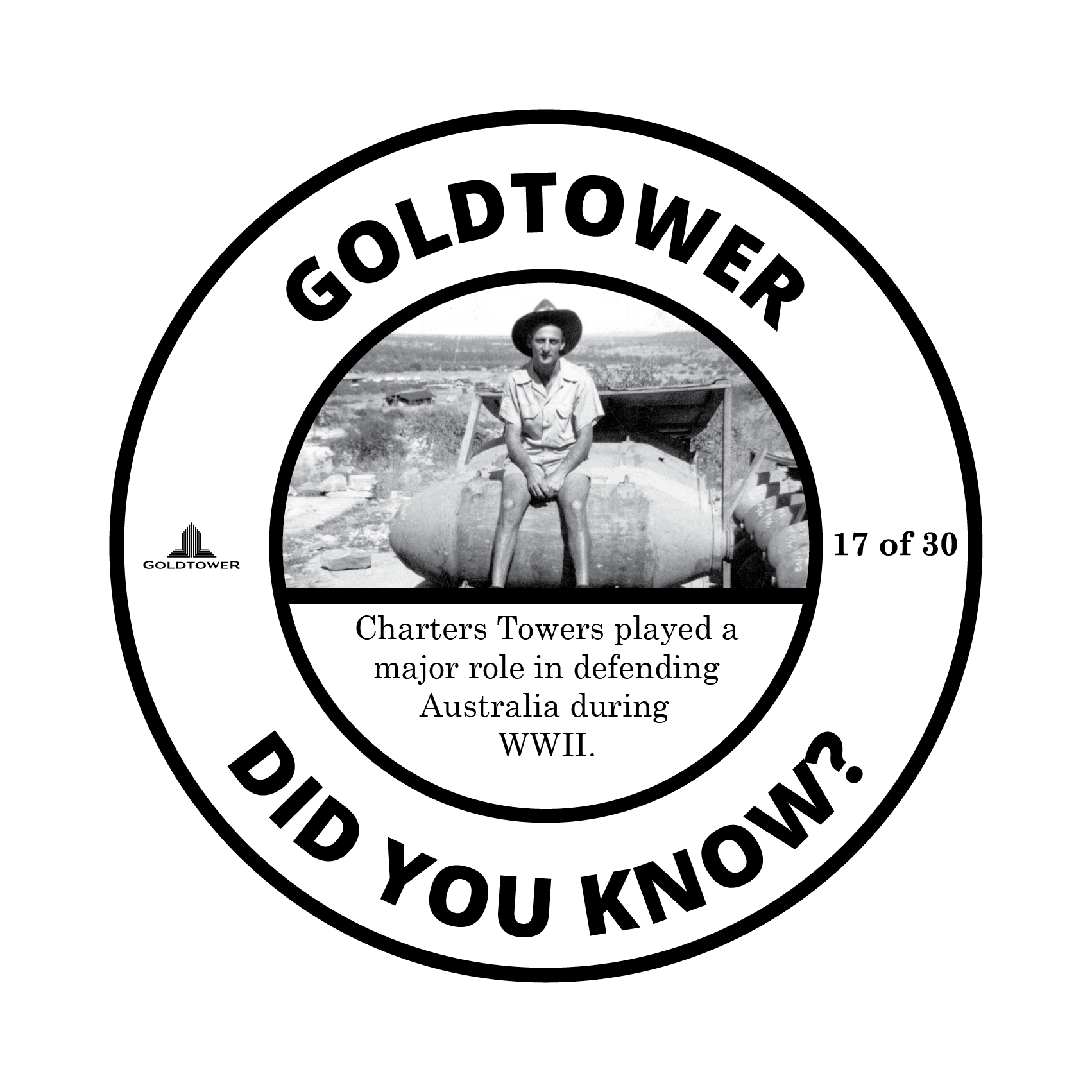
Print files
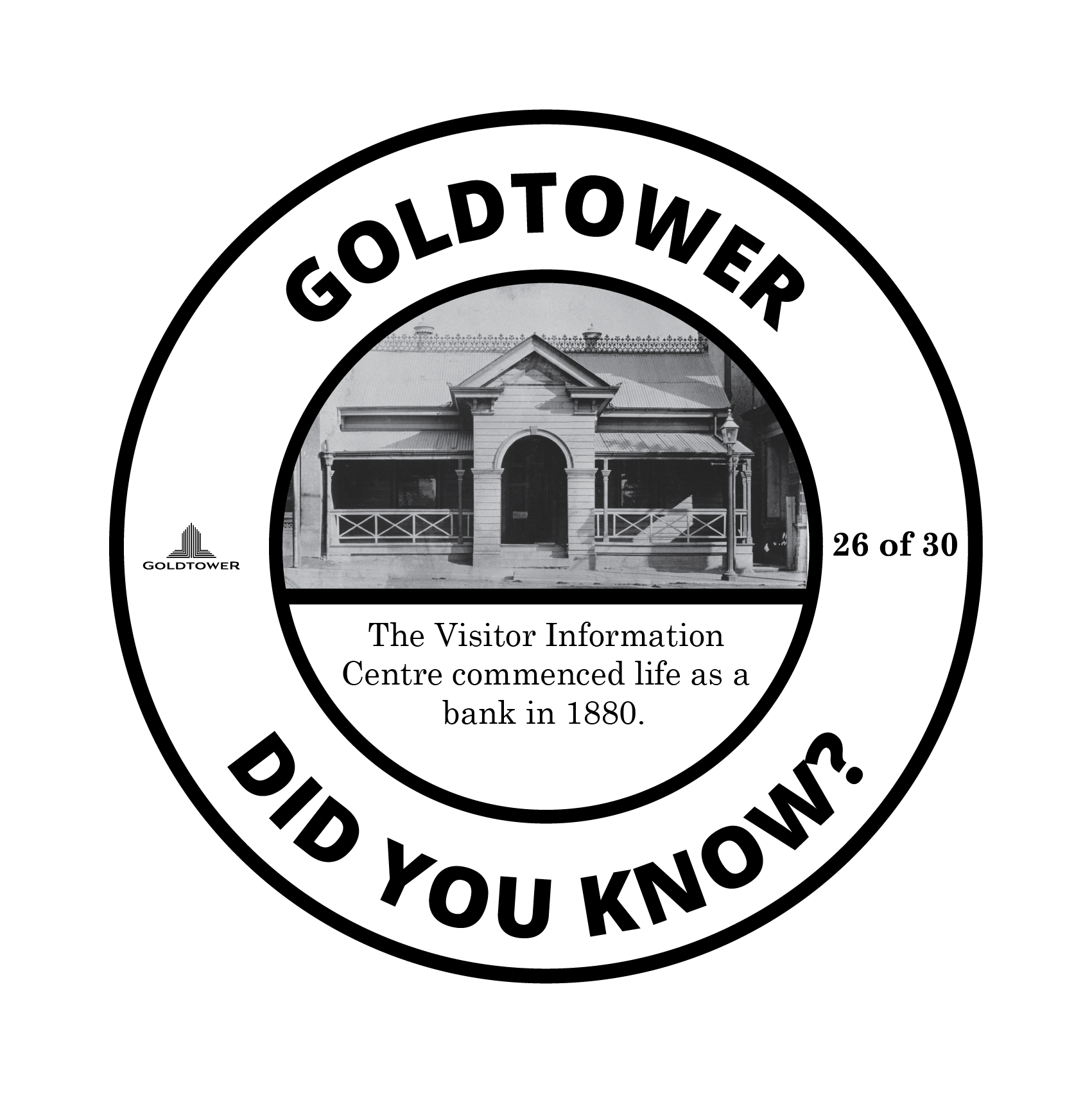
Print files
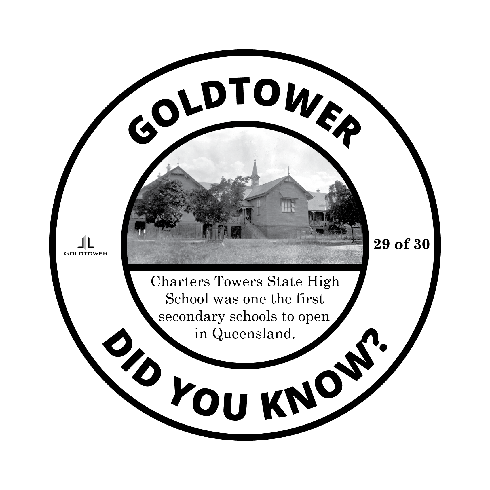
Print files
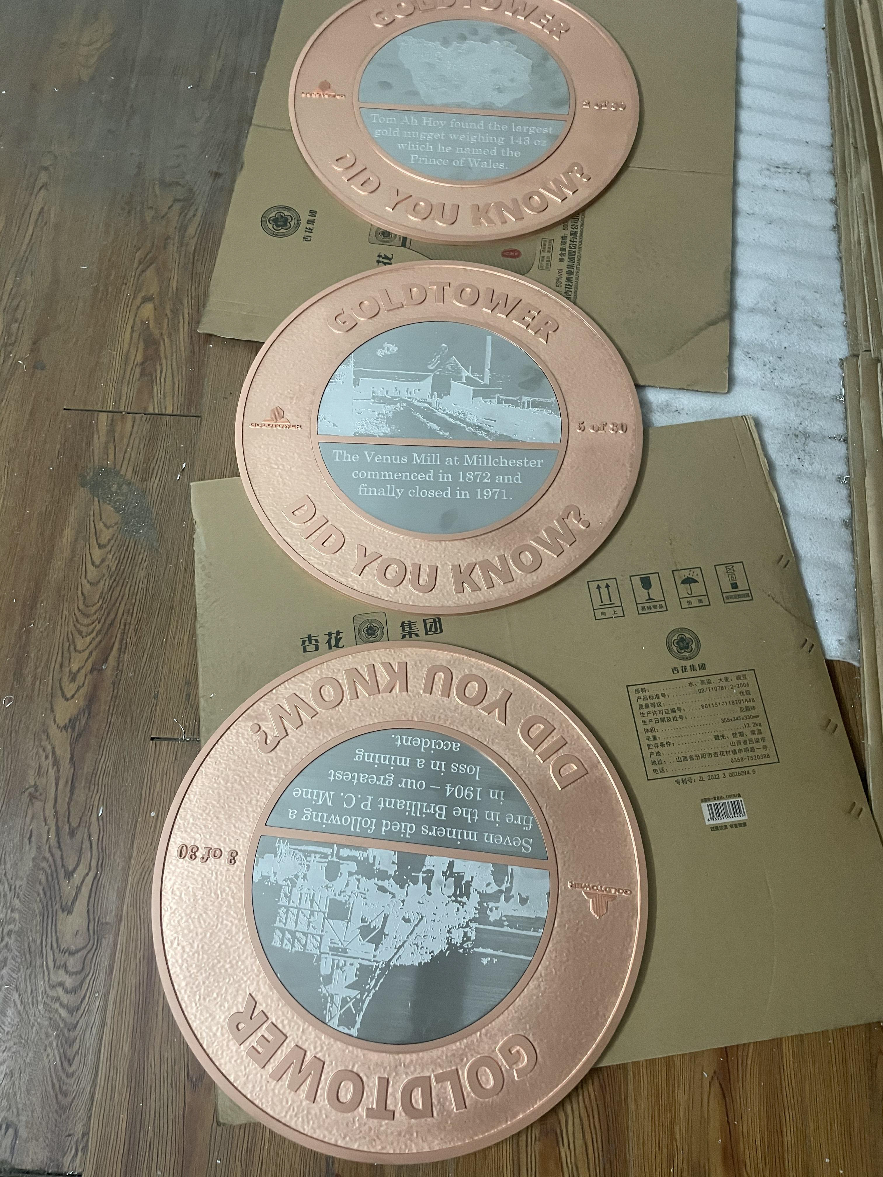
Final product to be installed in pathways
TIMELINE
Similar to the above project, I got to work with a Charters Towers historian to come up with sixty-nine 1m long timeline tiles that will be installed in the footpaths around Goldtower.
Below is a sample of some of the print files. These also have not been installed yet and I was also given a sneak peak from the factory.


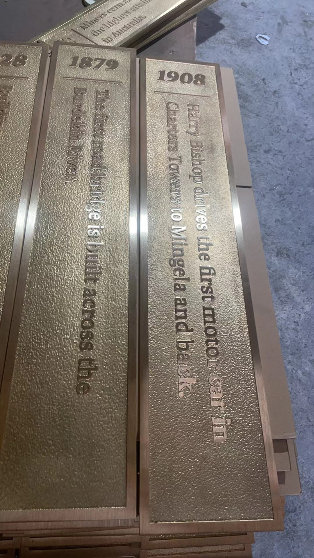
Goldtower Industrial Estate
For these projects I helped adapt the current ‘GoldTower Central’ logo for the new ‘GoldTower Industrial Estate’. I gave the client four variations of the logo with different shades of vintage green and the logo to the left is the final variations - these can be seen below.
The artwork to the left is a double shipping container billboard created for the site of GoldTower Industrial Estate. Here I got to develop the new Industrial Estate brand for the company and come up with the content to advertise what was available in the area.

Goldtower Industrial Estate Logo
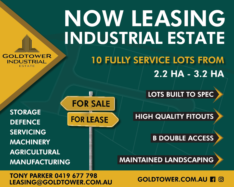
Goldtower Industrial Estate Billboard
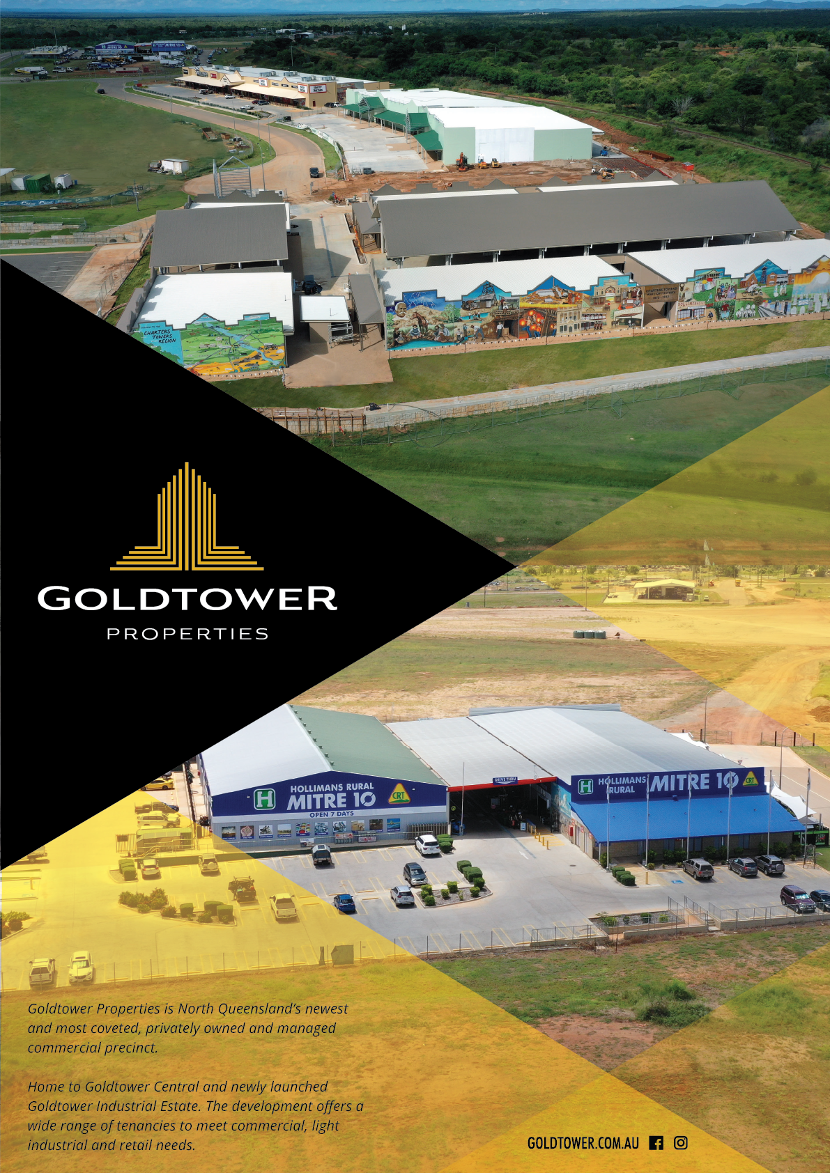
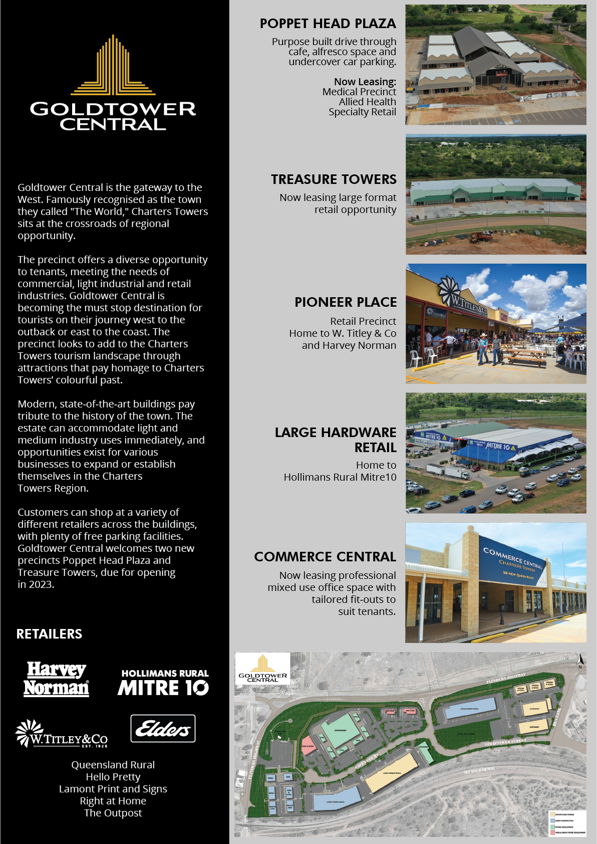
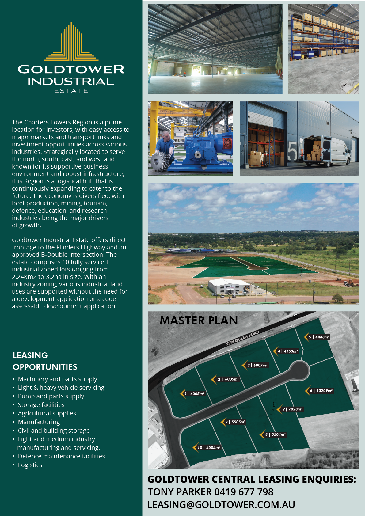
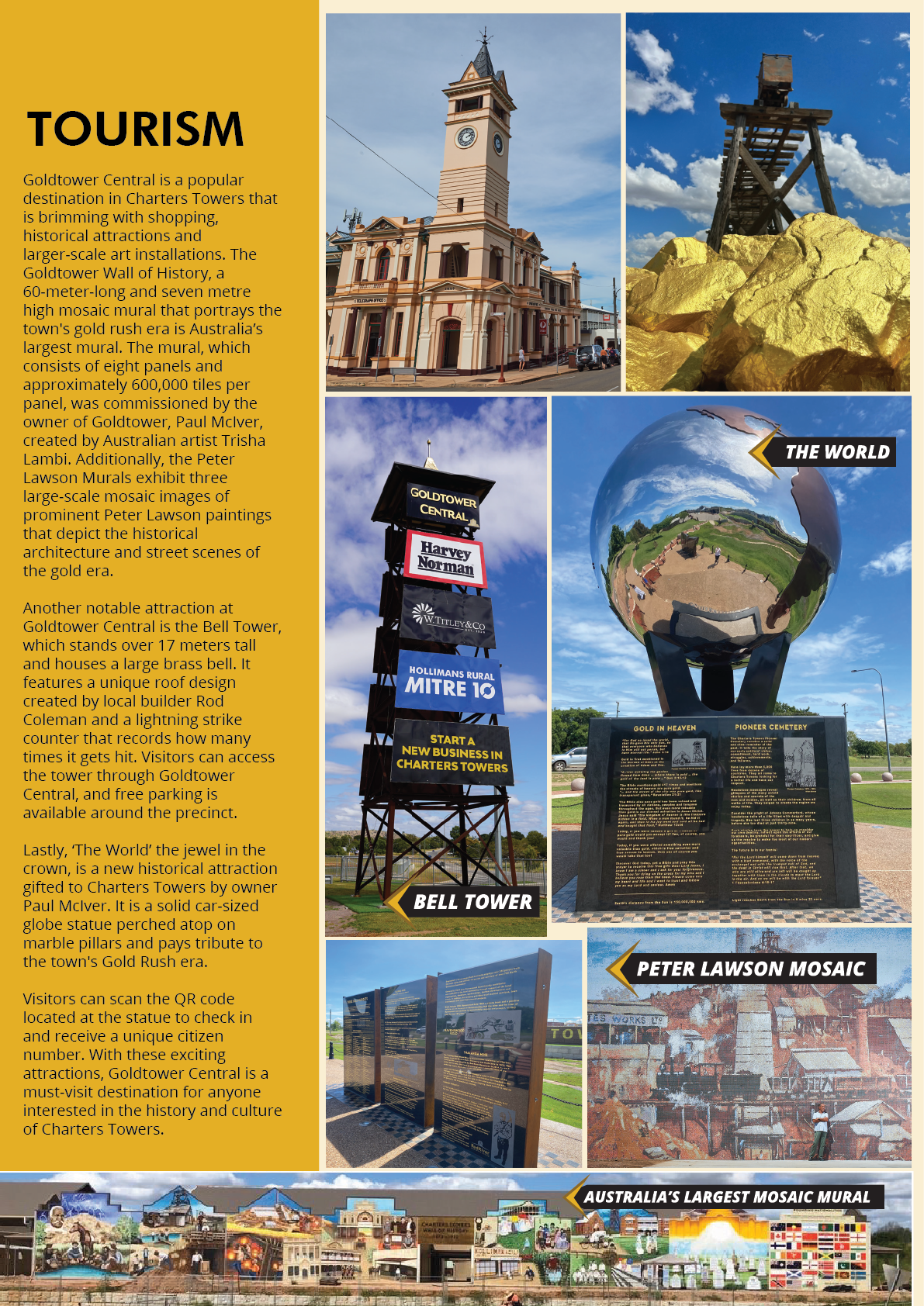
Goldtower Parliamentary Brochure
This is a brochure that I got to design for the owner of GoldTower to take to Parliament to showcase what GoldTower has to offer the region of Charters Towers.
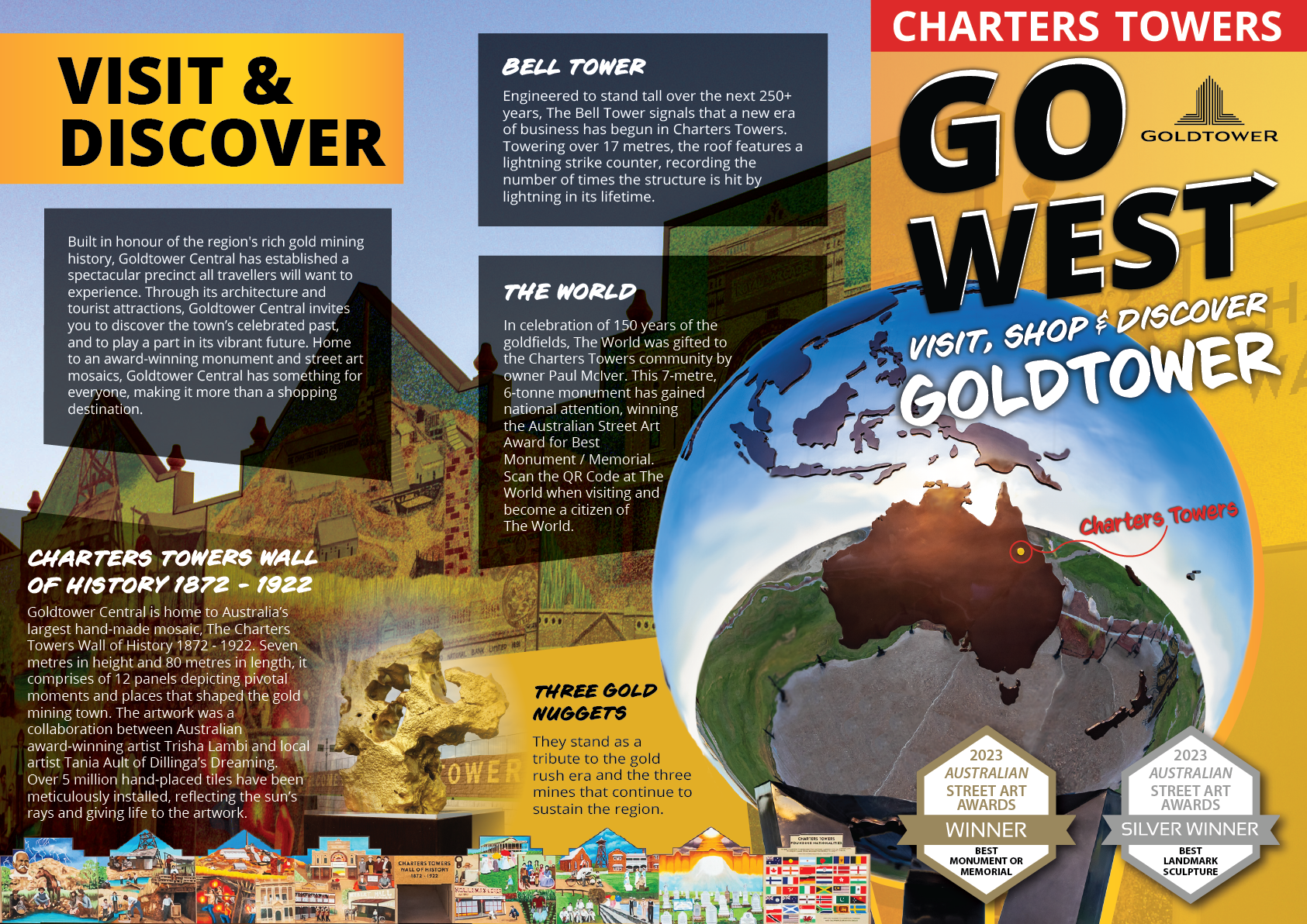
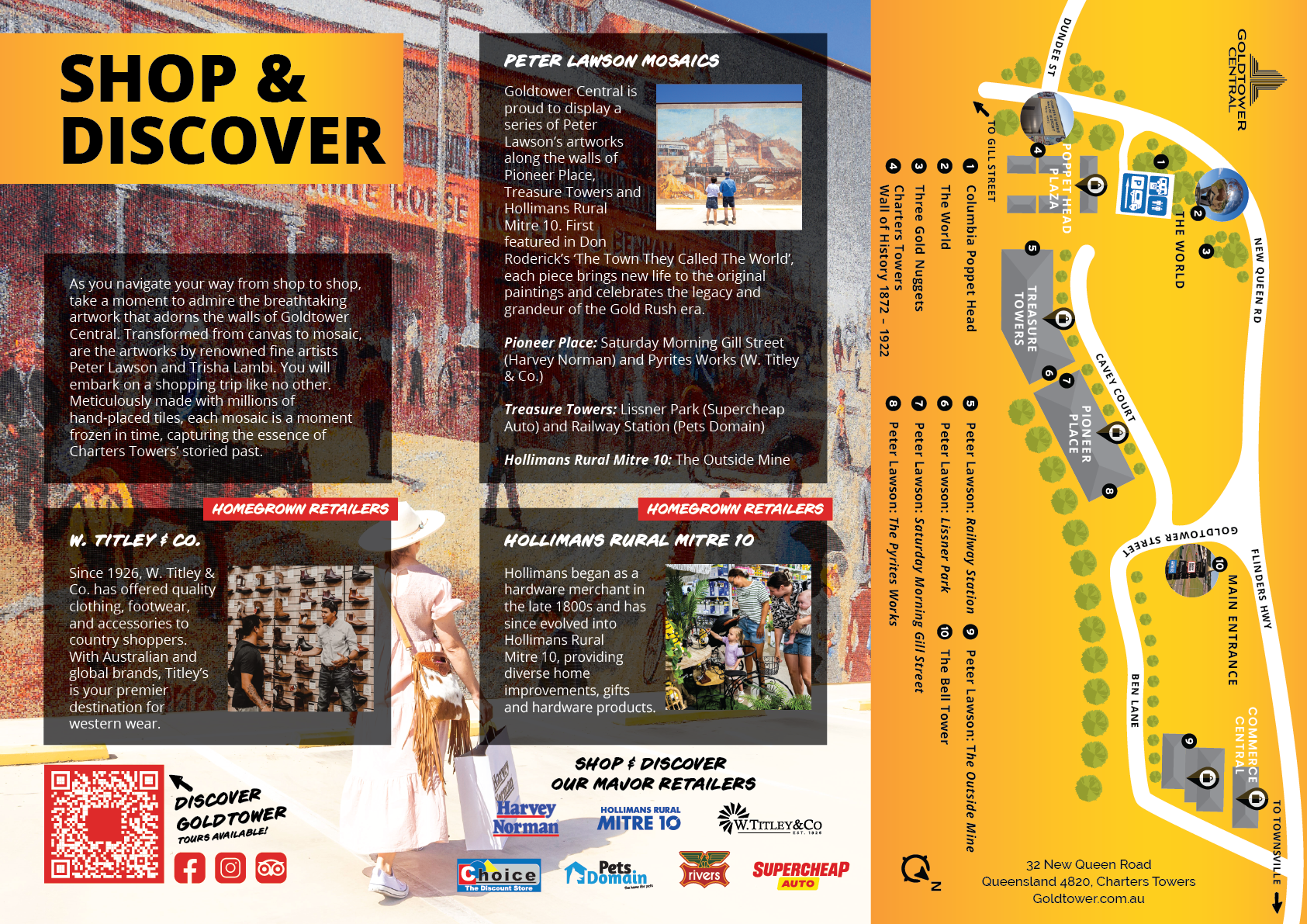
TOURISM Brochure
One of our main goals with Goldtower is to help make it a tourism designation, thus bringing more travellers to Charters Towers. This is a trifold DL brochure I created that is currently in distribution in Information centres around Queensland.
We collected other brochures to research what is eye-catching in an information centre. From that I chose a bright contrasting red to highlight where Goldtower is located and made sure the title views above other brochures in a display. I also really enjoy designs that aren't uniformly straight - I have been using angles for Goldtower artwork as seen in the 'Go West. Visit, Shop & Discover Goldtower' heading. I also used this on the first page text boxes. From feedback I was told this made it more interesting to look at.
I am very proud of this brochure and it is one of the first things I show when I am asked what I do for work.
T
News Xtend Campaigns
NEWS PAPER ARTICLES
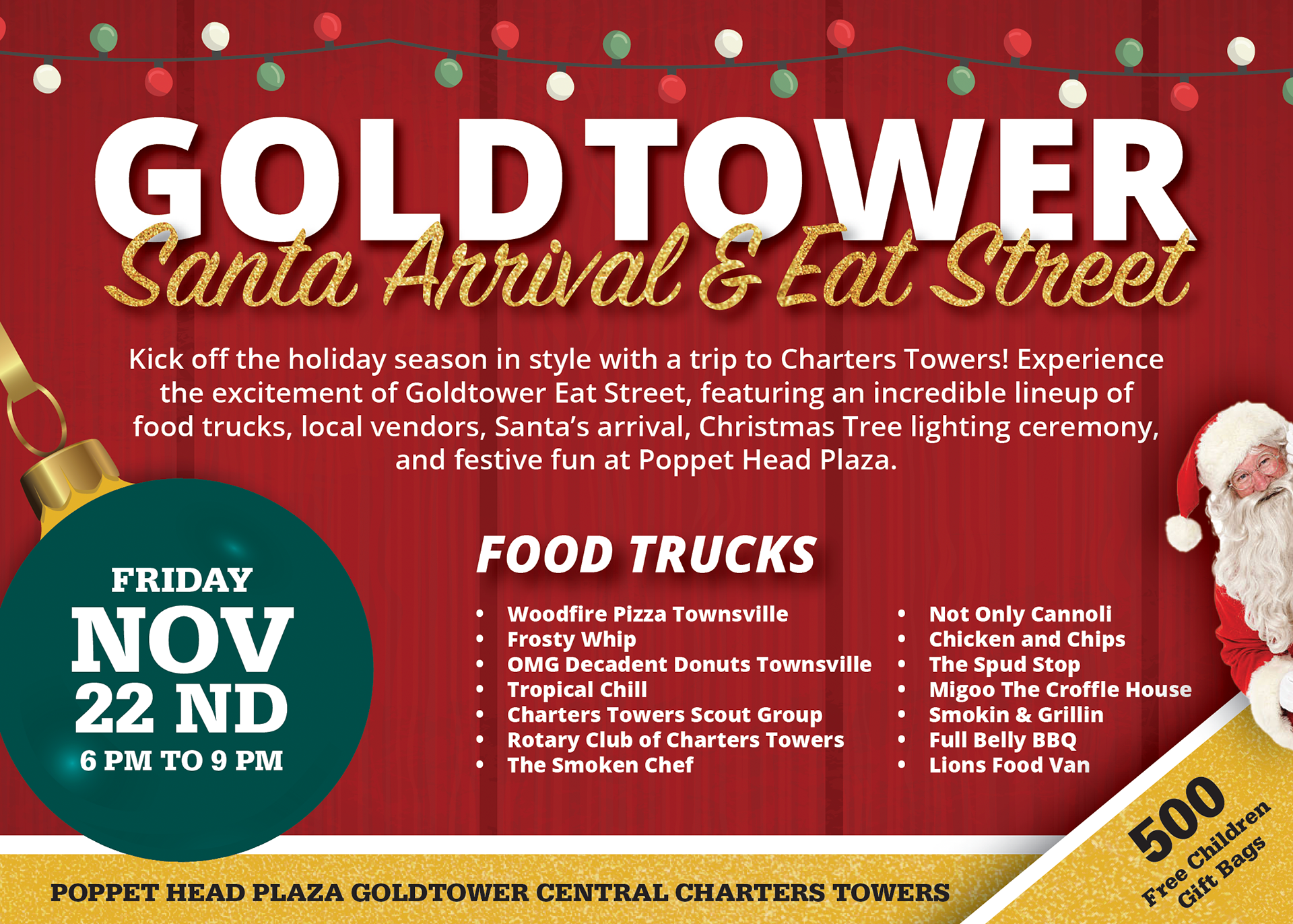
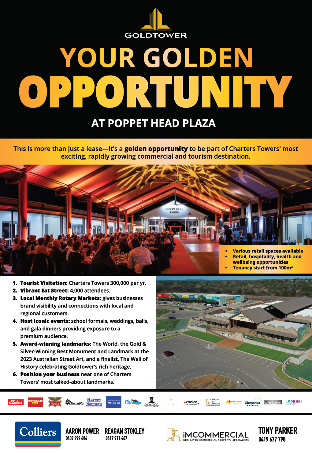
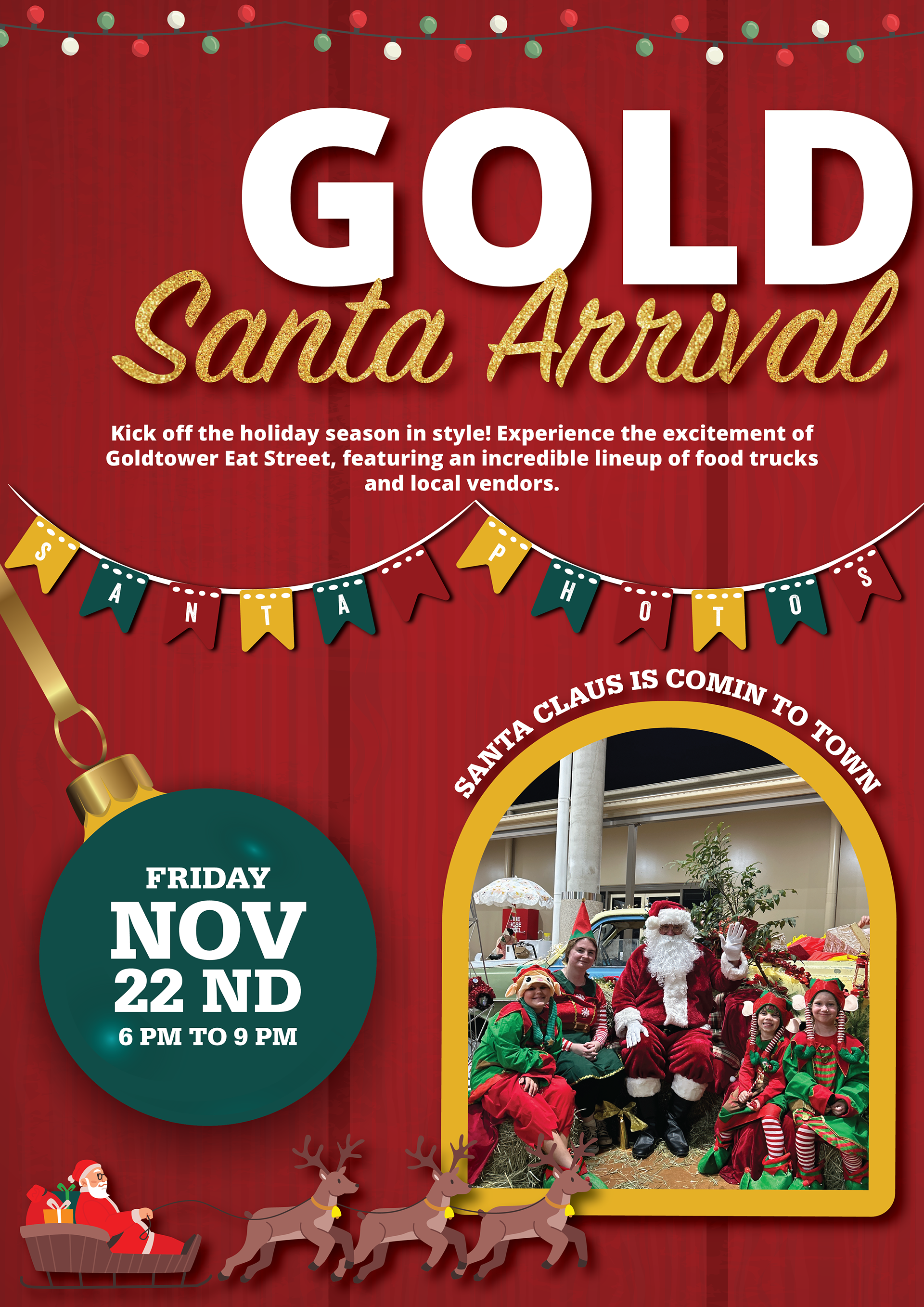
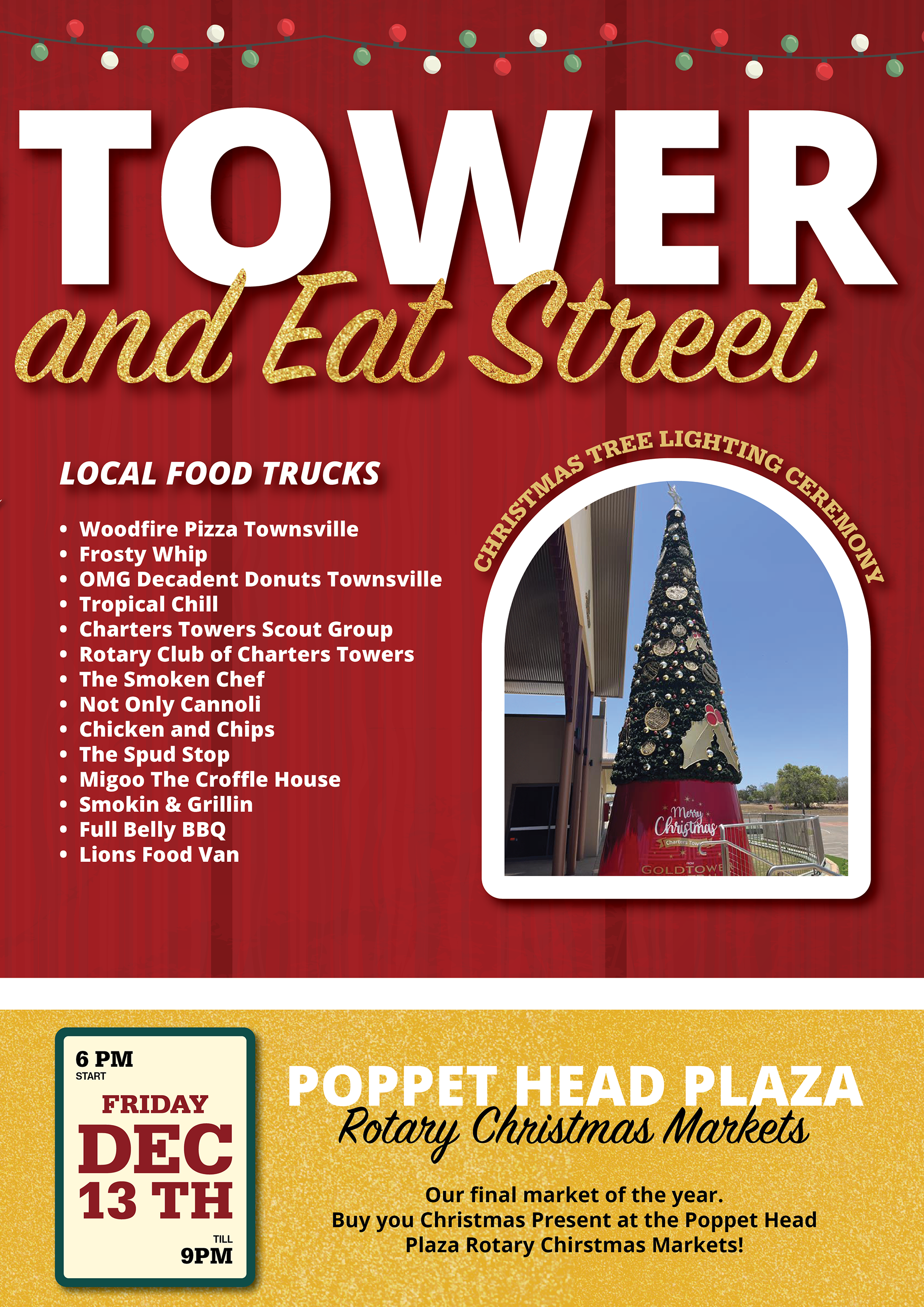
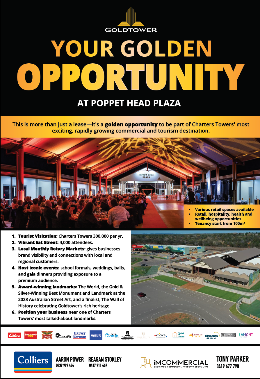
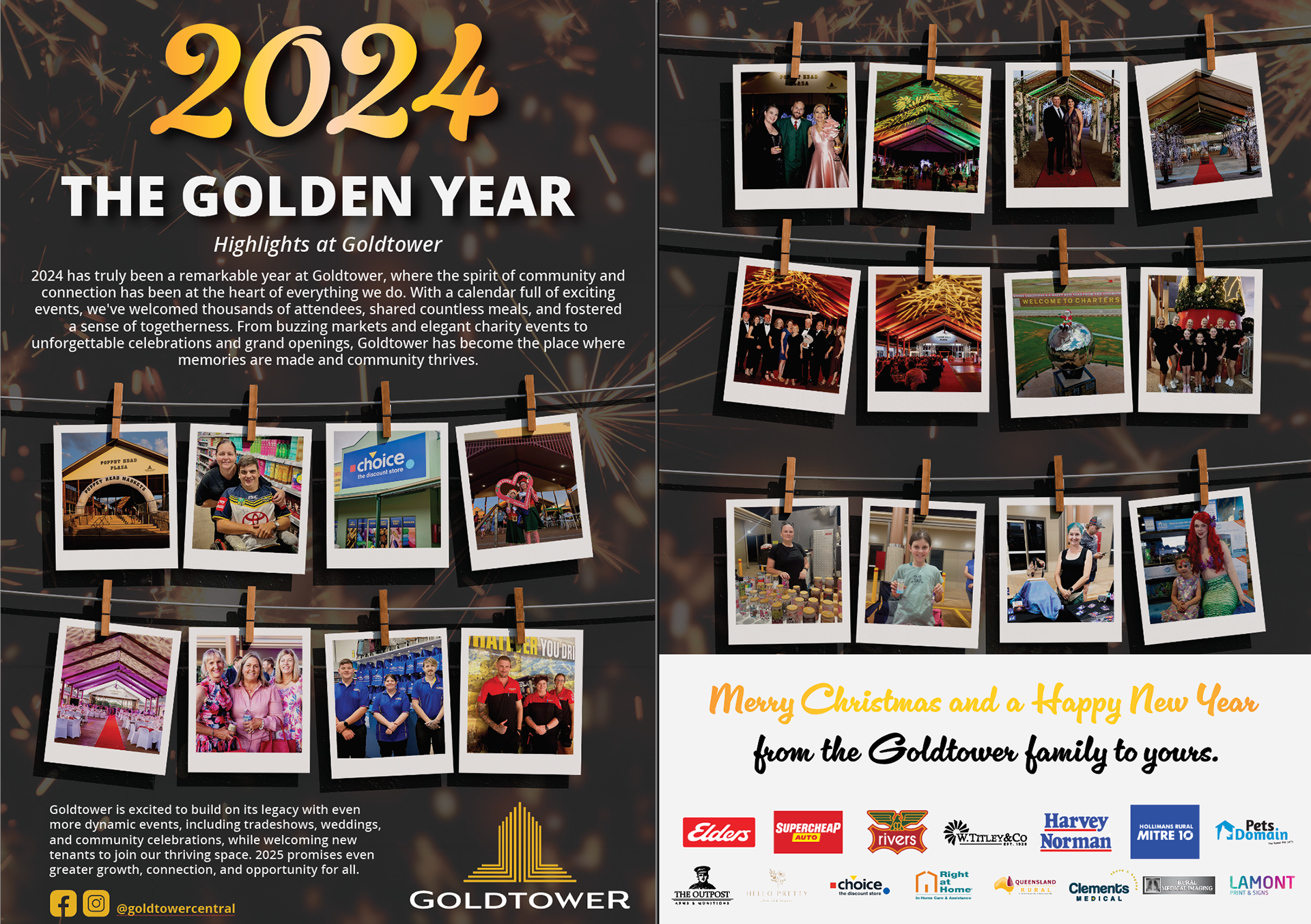
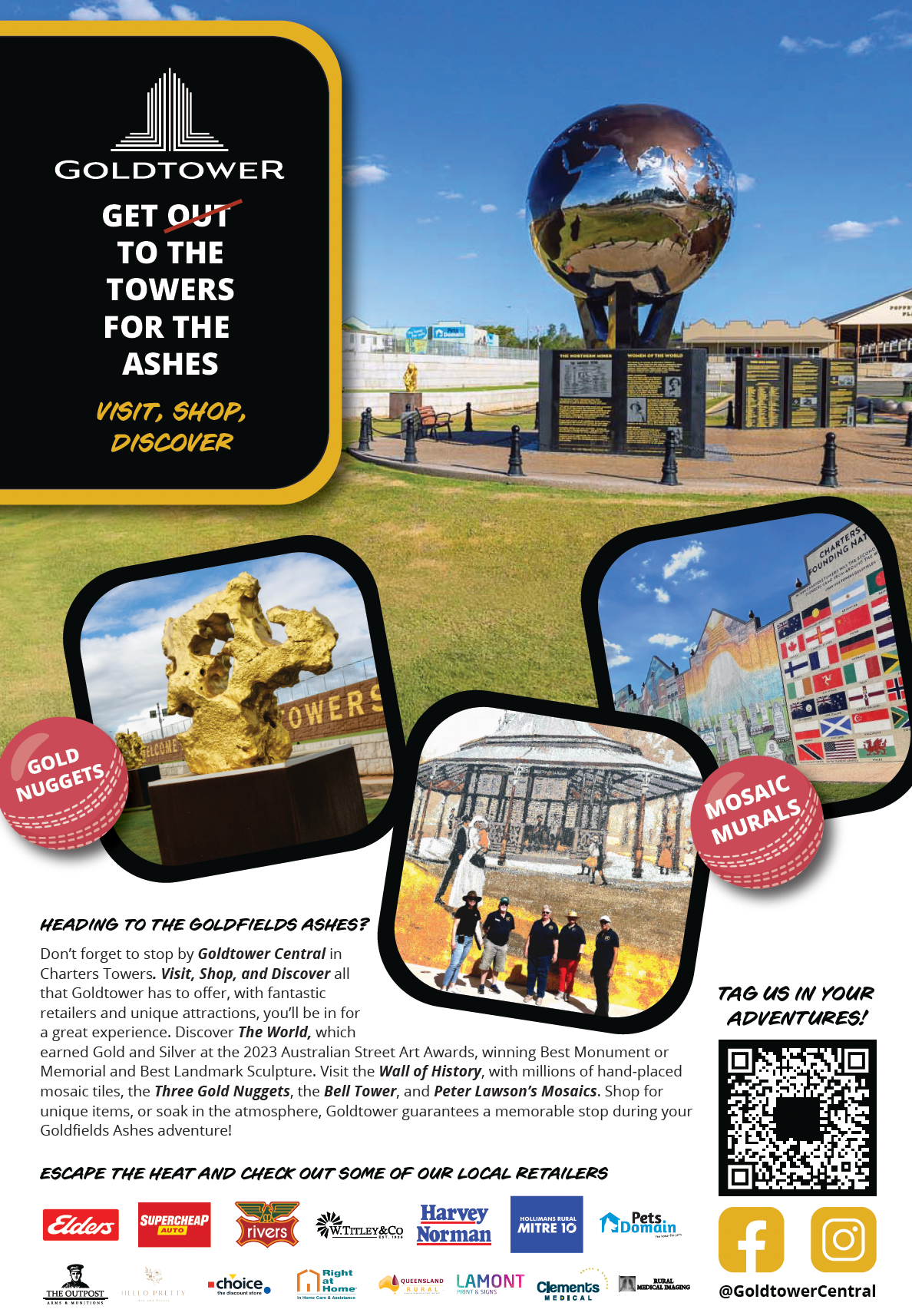
Goldtower requires us to advertise events, promotions, tourism, and leasing in local newspapers (Sumptons News and the Townsville Bulletin). These are some examples of newspaper articles that I have submitted.
